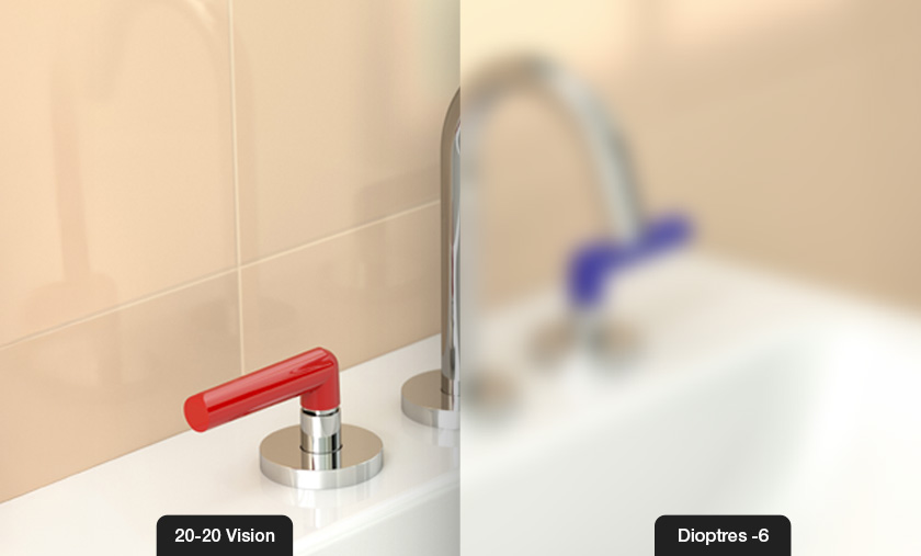

In designing environments that are safe, accessible, and user-friendly, every detail matters - right down to the tapware. For people with vision impairments, distinguishing between hot and cold taps or simply locating a tap can be a daily challenge. High-contrast tapware offers a simple but powerful solution, enhancing safety, independence, and confidence.
Vision impairments vary widely, from partial sight loss to colour blindness and degenerative conditions like age-related macular degeneration. These conditions can reduce a person’s ability to perceive subtle differences in colour, shape, or placement, which are critical in everyday interactions with fixtures such as taps.
For individuals affected, identifying which tap dispenses hot or cold water, or even simply finding the tap handle, can be difficult and potentially dangerous. This makes thoughtful design essential for promoting usability and preventing accidents.
Why Contrast Matters in Tapware Design
High-contrast tapware utilises bold, distinguishable colours, commonly red for hot water and blue for cold, to provide clear visual cues. This strong colour differentiation helps people with low vision or colour discrimination challenges quickly and confidently identify the correct tap.
Contrast doesn’t only refer to colour but to the entire visual relationship between the tapware and its background. For example, a red handle on a white basin or a dark blue lever on a light surface significantly improves visibility. This reduces hesitation and mistakes, which can lead to scalding injuries or discomfort.
Safety Benefits of High-Contrast Tapware
The most immediate benefit of high-contrast tapware is enhanced safety. In environments such as aged care facilities, hospitals, or homes with elderly or visually impaired residents, the risk of burns from hot water is a serious concern. Clear colour coding helps mitigate this risk by making it easier to distinguish taps at a glance.
Beyond safety, high-contrast tapware promotes independence by enabling users to manage their personal hygiene with less assistance. This not only fosters dignity but also reduces the workload for caregivers, creating a more supportive living environment.
Compliance with Australian Standards (AS 1428.1)
Australia’s AS 1428.1 Standards sets out guidelines and requirements to ensure buildings and facilities are accessible to people with disabilities, including those with vision impairments. AS 1428.1 emphasises the importance of clear visual contrast between fixtures and their surroundings to aid identification and use.
Australian accessibility guidelines, including AS 1428.1, recommend a minimum contrast difference of 30% or more between fixtures and their backgrounds to ensure adequate visibility. Achieving this level of contrast is essential to accommodate a wide range of vision impairments and lighting conditions, making the tapware easier to locate and use safely.
Environmental and Maintenance Considerations
High-contrast tapware isn’t just designed for visibility; it’s engineered to withstand the rigors of commercial and healthcare environments. Finishes should resist fading and staining, ensuring the contrast remains effective for years.
Additionally, smooth, easy-to-clean surfaces help maintain hygiene standards critical in hospitals and aged care, while preventing the build-up of dirt that can obscure important visual cues.
Why Choose Galvin Engineering’s High-Contrast Tapware?
At Galvin Engineering, we are committed to inclusive, evidence-based design solutions that meet the real needs of users. Our high-contrast tapware:
- Complies with AS 1428 and other relevant accessibility standards
- Uses bold colour contrast to maximise visibility and safety
- Incorporates ergonomic handles for ease of use and tactile identification
- Features durable, hygienic finishes for long-lasting performance
- Is suitable for a variety of settings, including hospitals, aged care, and disability facilities
Choosing Galvin Engineering means investing in tapware that promotes independence, safety, and dignity for all users.


